Introduction
The Martvill app is a versatile and feature-rich platform designed to enhance the shopping experience for users. This document aims to provide a comprehensive overview of the various usages of the Martvill app, highlighting its key functionalities and benefits for both customers and sellers. By understanding the capabilities of the Martvill app, users can make the most of its features and optimize their shopping and selling experiences.
Splash Screen (Getting Started):
The Martvill app utilizes a splash screen as the initial screen displayed upon app launch. The purpose of the splash screen is to provide users with a visually engaging and branded introduction to the app while essential background processes are being loaded
Welcome Screen (Onboarding steps):
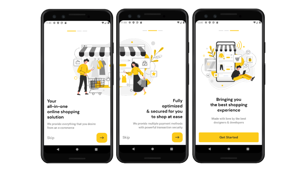
Here is an overview of the Welcome Screen The welcome screen consists of multiple steps or screens to briefly introduced The application. You can Skip or Forward by clicking the button.
Home Screen:
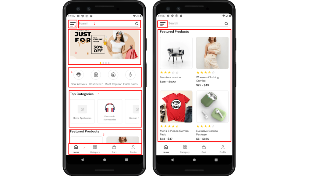
After clicking the “Get Started” button from the last onboarding step. You will see the next “Home screen” of the Martvill app. The app’s Home screen contains a features banner, a search box for quick searches, top categories for easy browsing, and a section showcasing featured products. The bottom tab navigation allows seamless access to different app sections.
1. Menu Drawer:
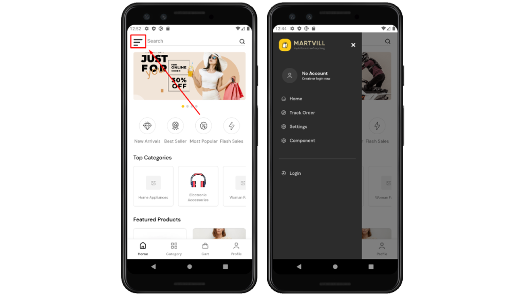
After clicking the 3 bar button, the “Menu drawer” comes from the left side, and details of its content you will see. Like bellow: –
- Login info
- Home
- Track Order
- Settings
- Component
Now skip this. We will discuss it next separately.
2. Searching and Filtering Products:
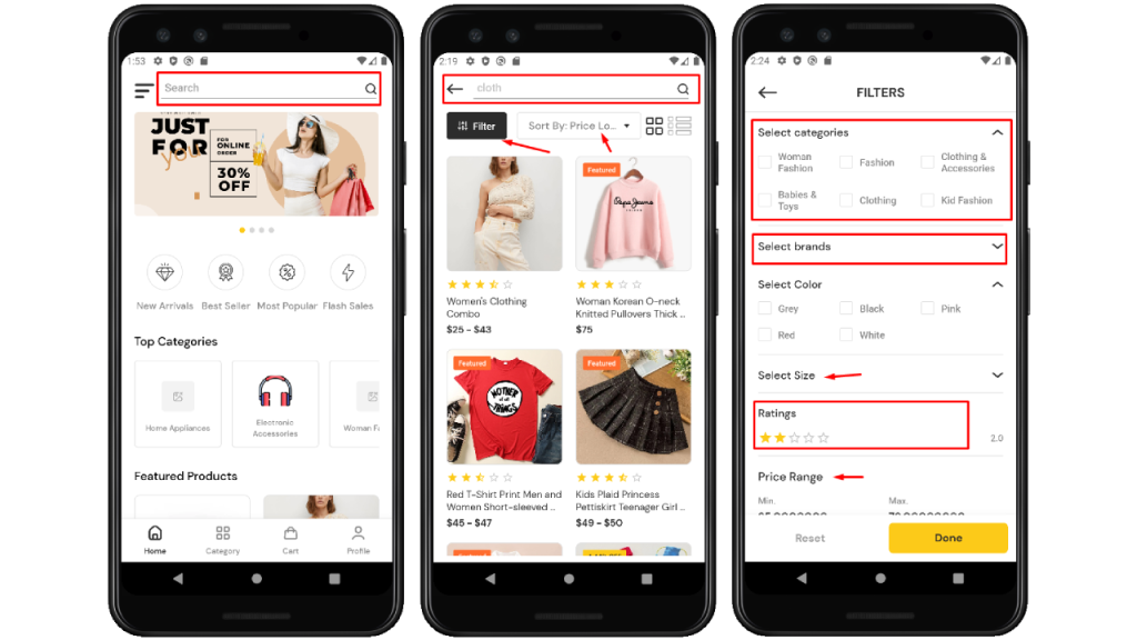
To search for a specific product, use the search box at the top of the app. Enter relevant keywords and wait for the search result. To refine your results, use the filter option. Look for the “Filter” button, select desired criteria (price, brand, category, color, etc.), and apply the filters by clicking the “Done” button. You can combine search and filter for more precise results. Enjoy finding your desired products easily!
3. App Banner:
The app banner is a visually appealing section at the top of the app, displaying important announcements, promotions, or featured content. It uses captivating images and concise text to grab attention and encourage user engagement.
4. Promotional Feature:
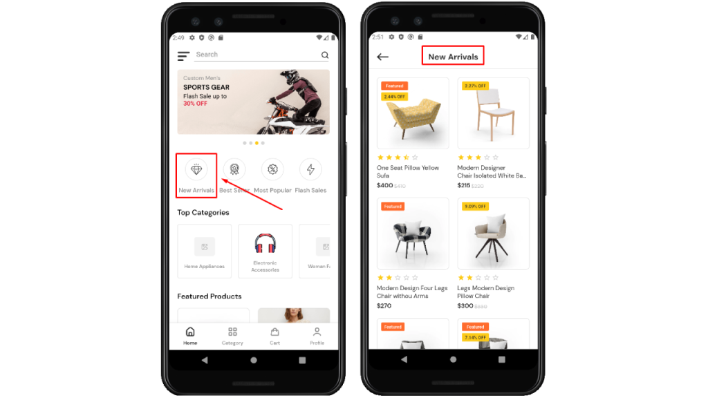
Section 4 demonstrates some types of promotional features: –
- New Arrivals
- Best Seller
- Most Popular
- Flash Sales
You will see the same screen containing related products with a title by clicking on every single promotional feature.
5. Top Categories:
The top categories product section highlights the main product categories in the app. It enables users to quickly browse and discover products based on their interests. Each category leads to a curated collection of relevant items, simplifying the search process for users.
6. Featured Products:
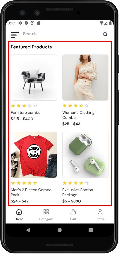
The featured products section showcases selected items on the app’s home screen. These products are chosen for their popularity and unique appeal. By highlighting featured products, users are encouraged to explore and discover exciting items easily.
7. Bottom Tabs Navigator:
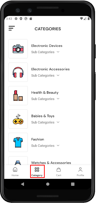
The bottom tabs navigator is a navigation bar located at the bottom of the app’s interface. It offers quick access to different sections or features of the app. Each tab represents a specific category or functionality, allowing users to easily switch between different areas of interest. Here tabs include “Home,” “Category,” “Cart,” and “Profile.” By tapping on a tab, users can seamlessly navigate to the corresponding section of the app, enhancing their overall user experience and facilitating efficient navigation.

a. Home: The “Home” tab is the main screen of the app. It offers essential information, personalized content, and updates. Selecting the “Home” tab brings users back to the central hub, providing a seamless navigation experience. The tab displays a customized feed or featured products based on user preferences.
b. Category: The “Category” tab enables users to explore product categories effortlessly. By selecting the “Category” tab, users can easily browse through various categories and subcategories. This tab simplifies the process of finding products based on specific interests or preferences, enhancing the overall user experience.
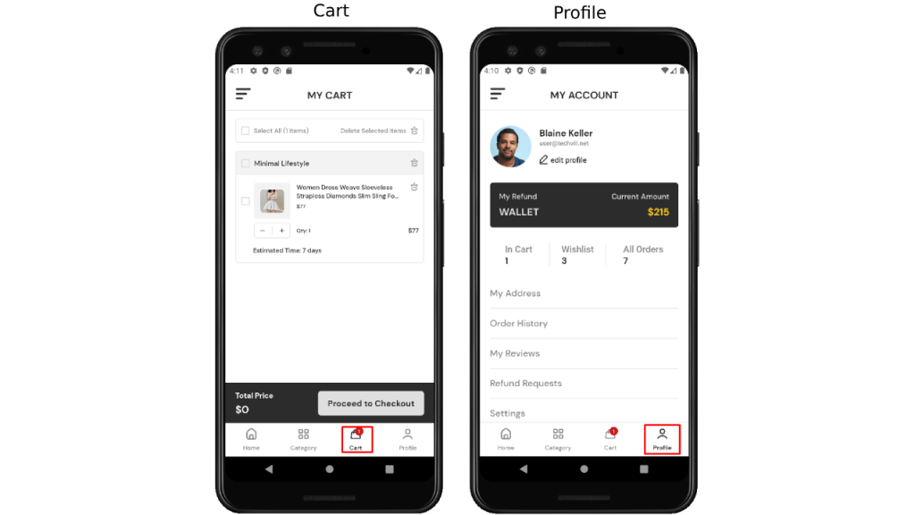
c. Cart: By selecting the “Cart” tab, users can quickly view and manage the items they have added for purchase. This tab allows users to review their selected products, update quantities, apply coupons, and proceed to checkout when ready. It offers a convenient way to keep track of shopping progress and ensures a seamless and efficient shopping experience within the app.
d. Profile: The “Profile” tab provides users with access to their personal account settings. By selecting the “Profile” tab, users can manage their profile information, preferences, and view order history. It serves as a central hub for users to customize their app experience and access important account-related features.
